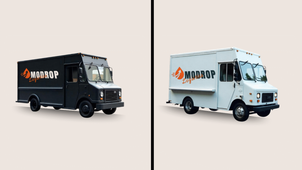
Modrop was created to redefine speed, precision, and reliability in the logistics industry. The company name, derived from “Momentum” and “Drop,” symbolizes their mission: to keep goods moving and ensure swift, seamless deliveries at every scale. Starting in a small warehouse in Abuja, Modrop quickly expanded, earning a reputation for blending cutting-edge technology with old-school dependability. Their focus: effortless movement, customer transparency, and trusted partnerships.
In an increasingly crowded logistics market, I saw a need for Modrop to visually communicate agility, trust, and innovation. The goal was to build an identity that feels dynamic, bold, and future-focused, while maintaining a grounded, professional tone that business clients would respect.
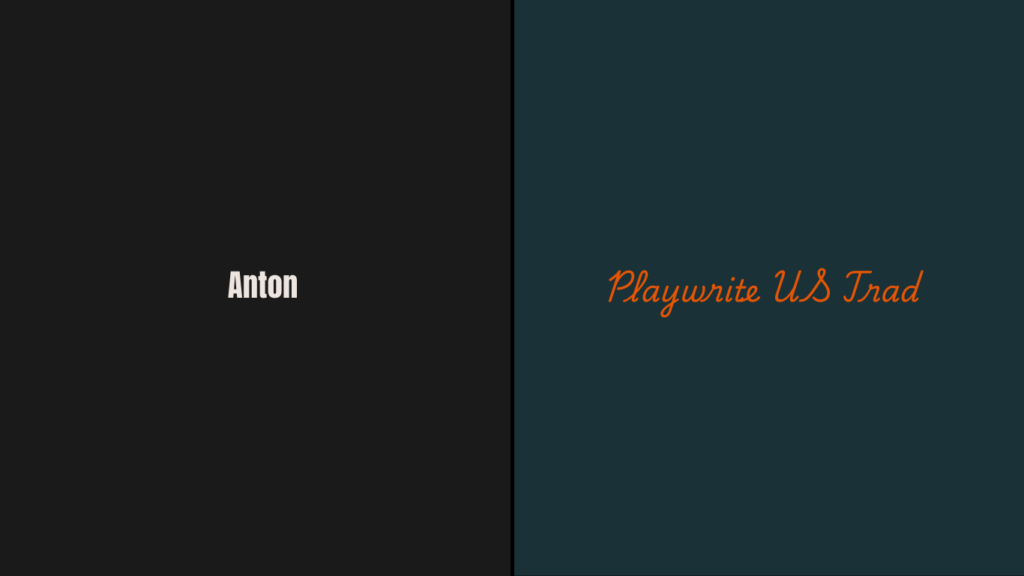
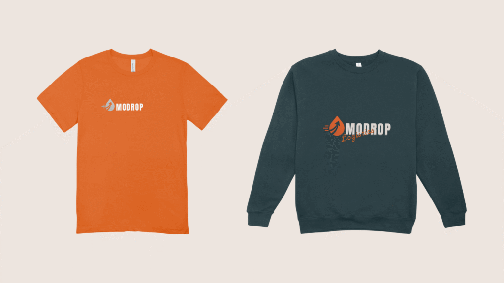
Typography is a crucial element of brand identity because it shapes how people feel about a brand before they even read a word. The choice of fonts affects readability, emotional connection, and perceived trustworthiness.
Anton is a heavy, bold display font that immediately grabs attention. Its strength and solidity perfectly align with Modrop’s values of reliability, momentum, and power. It makes the brand feel dependable and capable — exactly what clients expect from a logistics company.
Playwrite US Trad adds a unique, slightly traditional touch to the brand. While Anton is bold and forceful, Playwrite US Trad brings in authenticity, trust, and professionalism. It softens the energy of the design with a classic but accessible tone — suggesting that Modrop is not only fast and modern but also grounded and dependable over the long haul.